
Atrilyx is a cutting-edge SaaS platform designed to unify disparate network data and provide a comprehensive view of advertising campaign performance. With an intuitive dashboard, Atrilyx transforms complex metrics into clear, actionable insights, empowering smarter, data-driven decisions.
UX/UI Design
Design Systems
Data Visualization
User-testing
Project Management
Product Managers
Engineers
Front-End & Back-End Developers
Senior Software Developers
Database Engineers
Systems Administrators
C-Suite Stakeholders
Figma
Adobe XD
Whimsical
Adobe Illustrator
Adobe Photoshop
Adobe After Effect
Cinema 4D
Lottie Files
Ai Media Group’s outdated reporting platform created major roadblocks for growth, sales, and client acquisition. The system was slow, unreliable, and built on an aging desktop framework, making it difficult to meet modern business needs. Data was fragmented across multiple platforms, leading to inefficiencies, inconsistencies, and a frustrating user experience. To move forward, we needed to consolidate all reporting tools into a single, unified dashboard that could provide a reliable, real-time view of advertising performance.
Our goal was to build a scalable, high-performing application that served both internal teams and clients who relied on accurate data. Transitioning from a multi-platform system to one holistic source of truth required a complete overhaul. We needed built-in account structures, an intuitive onboarding process, account creation capabilities, and advanced settings to support different user roles. With a small team, we took an agile approach, iterating on data structures and visualization strategies to create a seamless, future-proof reporting tool.

The existing reporting platform was outdated and lacked essential features for modern data analysis. Such as global filters, slicers, dropdowns, user centric design, and more.

Frequent delays and system failures made the platform unreliable, eroding user trust and productivity.

Restricted to an old desktop framework, the platform failed to provide flexibility for users needing responsive interface for different desktop views.

Advertising data was silced across multiple SaaS platforms, leading to inefficiencies and errors.

The dashboard serves a wide range of users, including owners, administrators, in-house employees, as well as clients and their organizational representatives. Owners and administrators rely on the platform for high-level insights and control, ensuring seamless management and optimization of campaigns. In-house employees benefit from streamlined access to data, allowing for efficient reporting and decision-making. Clients, along with their teams, can easily monitor campaign performance, track progress, and gain actionable insights to drive success. This inclusive design ensures all stakeholders can interact with the data in a way that suits their unique roles and responsibilities.

High-level performance insights to make strategic decisions and ensure overall business growth.

Manage user permissions, troubleshoot technical issues, and ensure the platform operates smoothly.

In-depth data analysis to optimize advertising campaigns and improve performance metrics.

Access to real-time performance data for client reporting.


Users of the dashboard, including business owners, administrators, and in-house employees, value how the platform simplifies complex data into actionable insights. It enables seamless collaboration, clear reporting, and fast, data-driven decision-making. The intuitive design ensures that all user types—from clients to administrators—can easily navigate and access the information they need, allowing each user to contribute effectively to the overall success of campaigns. This ease of use empowers teams to make informed decisions and enhance performance across all levels of the organization.
Despite its strengths, users identified several areas for improvement. They requested better use of whitespace and layout to group visualizations, making analysis quicker and uncovering new revenue opportunities. The ability to compare data trends over time, such as day-over-day and month-over-month with detailed filtering, would provide deeper insights. Users also found tabular data too dense and sought simpler, summarized KPIs that are easy to read and explore further. Lastly, the manual effort required to gather and integrate various data points was time-consuming, and streamlining this process would save time and improve efficiency. As well as implementing various features to make the user experience better.
Our process began with a deep dive into identifying the key challenges users faced and setting clear objectives to improve the overall experience. Recognizing the diverse needs of different user roles, we prioritized understanding their specific requirements and pain points to ensure our approach was both targeted and impactful. Armed with this knowledge, we initiated the project with a kickoff meeting where the team collaboratively restructured the dashboard’s site map. This step was crucial in defining the platform’s main framework, enabling us to outline essential features, user workflows, and high-level goals. By mapping out the structure early on, we could align our design and development processes with the timeline and key deliverables. This methodical approach ensured that every decision was intentional, laying the groundwork for a cohesive and user-centric dashboard solution.

Our design focused on creating an intuitive, efficient dashboard that empowers users with clear data insights and seamless navigation

The dashboard is built to adapt to varying user needs, ensuring accessibility across multiple devices and offering customizable views that meet different business requirements.

With a focus on simplicity, the design prioritizes ease of use, making complex data easy to digest, and ensuring that every feature is intuitive and aligned with user goals.

We designed the dashboard to grow with the business, offering scalable solutions that automate key processes, saving time while enabling users to focus on strategic decision-making.
To deliver a meaningful and effective dashboard, we meticulously mapped out user flow for each persona and role. Since the dashboard served diverse users—from owners and administrators to in-house employees and clients—each journey had to address specific objectives, workflows, and pain points. By tailoring these journeys, we ensured that every user could intuitively navigate the platform, complete tasks efficiently, and extract actionable insights with ease. This process laid the foundation for creating an inclusive, role-specific experience that enhanced productivity and engagement.
.jpg)

Wireframes were a critical step in translating ideas into tangible solutions. With a deep understanding of user roles, features, goals, and challenges, we developed robust wireframes that focused on structure, functionality, and information hierarchy. These blueprints allowed us to visualize the layout and refine the placement of key elements to prioritize usability. By addressing potential pain points early and aligning the design with user needs, the wireframes ensured that the dashboard’s framework was both intuitive and capable of delivering a seamless user experience.
A comprehensive UI Kit ensured design consistency and efficiency across the entire dashboard. This toolkit included predefined components like typography styles, color palettes, buttons, and icons that aligned with the brand’s identity and functionality goals. By using a standardized set of elements, we reduced development time and maintained a cohesive visual and interactive experience. The UI Kit also allowed for easy scalability, enabling future updates to seamlessly integrate into the existing design framework without compromising the user experience.


Reusable components were the building blocks of the dashboard, offering flexibility and scalability. Elements such as data filters, trend charts, KPI modules, and modal windows were designed to work consistently across different sections of the platform. By creating these dynamic components, we reduced redundancy, improved development efficiency, and ensured a unified experience for users. Each component was rigorously tested to support diverse user scenarios, making the dashboard adaptable to evolving business needs and fostering a sense of familiarity and trust among users.
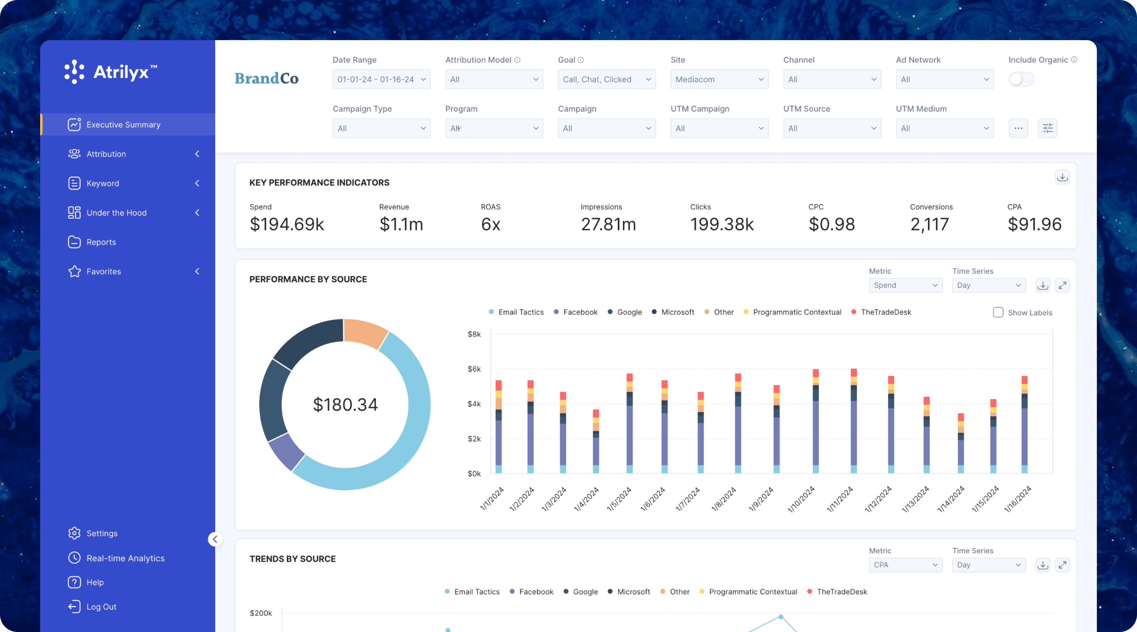
Seeing the dashboard come to life was a moment where all the research, effort, and collaboration truly came together. Every feature and detail reflected the insights we uncovered during the user research and the deliberate decisions made throughout the design process. The layout, now more intuitive and visually balanced, felt like a natural extension of the user journeys we mapped and the challenges we worked so hard to solve. The tailored features, clear data visualizations, and flexible filtering options were direct responses to user feedback, ensuring the platform didn’t just meet expectations but exceeded them. This first look wasn’t just about unveiling a product; it was about seeing how thoughtful design could translate complex needs into a cohesive and empowering experience.


Now that the dashboard is complete, the journey doesn’t end here—it’s just the beginning. The next steps are to make it even better: improving its speed, scaling its capabilities, and ensuring it continues to meet the evolving needs of users. As with any product, there will always be new features to implement, updates to introduce, and refinements to align with industry trends and user expectations. Whether it’s optimizing performance, enhancing the user interface, or staying ahead of design innovations, we’re committed to ensuring the dashboard grows and evolves into an even more powerful and adaptable tool.
Enhanced User Engagement: Platform interactions increased by 40%, demonstrating improved user adoption and engagement.
Optimized Reporting Efficiency: Reporting setup time was reduced by 60%, resulting in faster delivery of actionable insights.
Increased Feature Utilization: Advanced feature usage grew by 50%, empowering users to fully leverage the platform's capabilities.
Improved Client Retention: Client retention rates increased by 30%, driven by a more intuitive and seamless user experience.
Revenue Growth: Leveraging the enhanced dashboard capabilities, the company achieved a 25% increase in revenue by providing accurate and clean advertising data to clients.


